


Front-end JavaScript validation is a godsend when you don't want to perform countless validations on the back-end portion of a given web application or website. This guide teaches you my approach towards front-end validation using vanilla JavaScript.
We don't need frameworks or fancy plugins to make this work. Those come in handy if you find yourself doing things over and over but my best advice is to always start as lean as you can and scale your dependencies from there.
I created this all on a CodePen for your viewing pleasure. You can tweak it further and/or compare your version against mine if you decide to follow along (I recommend following along to learn by doing!).
For our validations to work properly we'll need some foundational HTML and CSS. Because this guide is primarily focused on JavaScript I'll skim through the HTML and CSS quickly.
📫Subscribe to me newsletter (sent weekly)
HTML
<div class="container">
  <h2 class="title">Create a new account</h2>
  <form action="#" class="form">

    <div class="input-group">
      <label for="username" class="label">Username</label>
      <input id="username" placeholder="webcrunch" type="text" class="input">
      <span class="error-message"></span>
      <svg class="icon icon-success hidden hidden" xmlns="http://www.w3.org/2000/svg" viewBox="0 0 20 20" fill="currentColor">
        <path fill-rule="evenodd" d="M10 18a8 8 0 100-16 8 8 0 000 16zm3.707-9.293a1 1 0 00-1.414-1.414L9 10.586 7.707 9.293a1 1 0 00-1.414 1.414l2 2a1 1 0 001.414 0l4-4z" clip-rule="evenodd" />
      </svg>

      <svg class="icon icon-error hidden" xmlns="http://www.w3.org/2000/svg" viewBox="0 0 20 20" fill="currentColor">
        <path fill-rule="evenodd" d="M18 10a8 8 0 11-16 0 8 8 0 0116 0zm-7 4a1 1 0 11-2 0 1 1 0 012 0zm-1-9a1 1 0 00-1 1v4a1 1 0 102 0V6a1 1 0 00-1-1z" clip-rule="evenodd" />
      </svg>
    </div>

    <div class="input-group">
      <label for="email" class="label">Email</label>
      <input id="email" type="email" class="input" autocomplete placeholder="andy@web-crunch.com">
      <span class="error-message"></span>
      <svg class="icon icon-success hidden" xmlns="http://www.w3.org/2000/svg" viewBox="0 0 20 20" fill="currentColor">
        <path fill-rule="evenodd" d="M10 18a8 8 0 100-16 8 8 0 000 16zm3.707-9.293a1 1 0 00-1.414-1.414L9 10.586 7.707 9.293a1 1 0 00-1.414 1.414l2 2a1 1 0 001.414 0l4-4z" clip-rule="evenodd" />
      </svg>

      <svg class="icon icon-error hidden" xmlns="http://www.w3.org/2000/svg" viewBox="0 0 20 20" fill="currentColor">
        <path fill-rule="evenodd" d="M18 10a8 8 0 11-16 0 8 8 0 0116 0zm-7 4a1 1 0 11-2 0 1 1 0 012 0zm-1-9a1 1 0 00-1 1v4a1 1 0 102 0V6a1 1 0 00-1-1z" clip-rule="evenodd" />
      </svg>
    </div>

    <div class="input-group">
      <label for="password" class="label">Password</label>
      <input id="password" type="password" class="input">
      <span class="error-message"></span>
      <svg class="icon icon-success hidden" xmlns="http://www.w3.org/2000/svg" viewBox="0 0 20 20" fill="currentColor">
        <path fill-rule="evenodd" d="M10 18a8 8 0 100-16 8 8 0 000 16zm3.707-9.293a1 1 0 00-1.414-1.414L9 10.586 7.707 9.293a1 1 0 00-1.414 1.414l2 2a1 1 0 001.414 0l4-4z" clip-rule="evenodd" />
      </svg>

      <svg class="icon icon-error hidden" xmlns="http://www.w3.org/2000/svg" viewBox="0 0 20 20" fill="currentColor">
        <path fill-rule="evenodd" d="M18 10a8 8 0 11-16 0 8 8 0 0116 0zm-7 4a1 1 0 11-2 0 1 1 0 012 0zm-1-9a1 1 0 00-1 1v4a1 1 0 102 0V6a1 1 0 00-1-1z" clip-rule="evenodd" />
      </svg>
    </div>

    <div class="input-group">
      <label for="password_confirmation" class="label">Password Confirmation</label>
      <input id="password_confirmation" type="password" class="input">
      <span class="error-message"></span>
      <svg class="icon icon-success hidden" xmlns="http://www.w3.org/2000/svg" viewBox="0 0 20 20" fill="currentColor">
        <path fill-rule="evenodd" d="M10 18a8 8 0 100-16 8 8 0 000 16zm3.707-9.293a1 1 0 00-1.414-1.414L9 10.586 7.707 9.293a1 1 0 00-1.414 1.414l2 2a1 1 0 001.414 0l4-4z" clip-rule="evenodd" />
      </svg>

      <svg class="icon icon-error hidden" xmlns="http://www.w3.org/2000/svg" viewBox="0 0 20 20" fill="currentColor">
        <path fill-rule="evenodd" d="M18 10a8 8 0 11-16 0 8 8 0 0116 0zm-7 4a1 1 0 11-2 0 1 1 0 012 0zm-1-9a1 1 0 00-1 1v4a1 1 0 102 0V6a1 1 0 00-1-1z" clip-rule="evenodd" />
      </svg>
    </div>

    <input type="submit" class="button" value="Create account">

  </form>
</div>

<div class="promo">👋 Check out my <a href="https://web-crunch.com" target="_blank">blog</a> or my <a href="https://youtube.com/webcrunch">YouTube channel</a> to learn more about how I made this.</div>
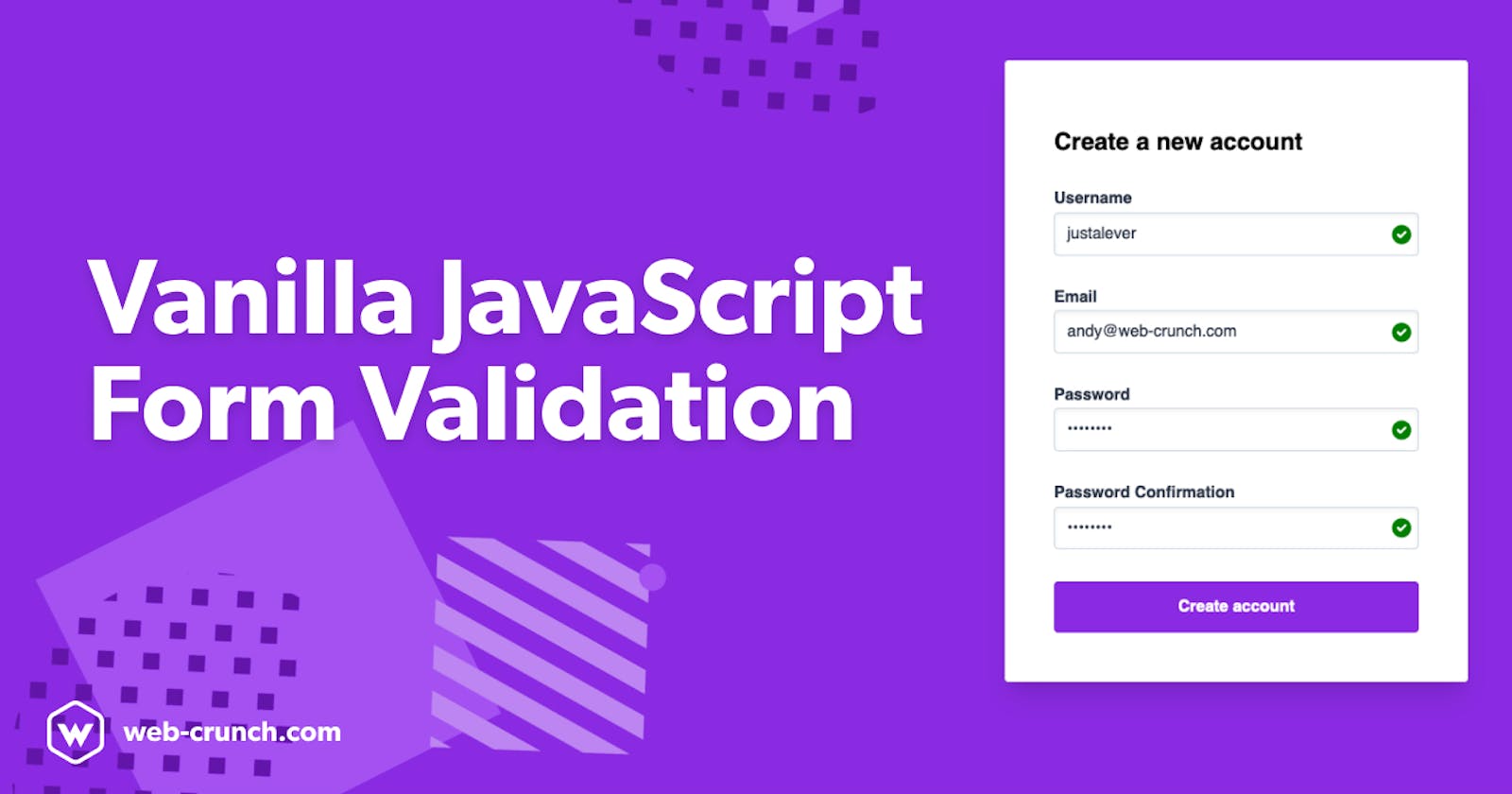
The UI shown here is a basic fictitious account setup form. This might be a form you see when first signing up for a service or application online. During this onboarding experience many application owners/operators want to only allow in valid data to make their own lives a bit easier down the line. If a public facing user can onboard successfully without the attention of an internal team that's the primary goal.
The form features a username, email, password, and password_confirmation field. Each field has it's own set of icons depicting it's "state" and an empty div for displaying errors as they might occur.
We'll target these fields, icons, and elements with JavaScript directly.
CSS
* {
    box-sizing: border-box;
}

body {
  background-color: blueviolet;
}

.title {
  margin-bottom: 2rem;
}

.hidden {
  display: none;
}

.icon {
  width: 24px;
  height: 24px;
  position: absolute;
  top: 32px;
  right: 5px;
  pointer-events: none;
  z-index: 2;

  &.icon-success {
    fill: green;
  }

  &.icon-error {
    fill: red;
  }
}

.container {
  max-width: 460px;
  margin: 3rem auto;
  padding: 3rem;
  border: 1px solid #ddd;
  border-radius: .25rem;
  background-color: white;
  box-shadow: 0 20px 25px -5px rgba(0, 0, 0, 0.1), 0 10px 10px -5px rgba(0, 0, 0, 0.04);
}

.label {
  font-weight: bold;
  display: block;
  color: #333;
  margin-bottom: .25rem;
  color: #2d3748;
}

.input {
  appearance: none;
  display: block;
  width: 100%;
  color: #2d3748;
  border: 1px solid #cbd5e0;
  line-height: 1.25;
  background-color: white;
  padding: .65rem .75rem;
  border-radius: 0.25rem;
  box-shadow: inset 0 2px 4px 0 rgba(0, 0, 0, 0.06);

  &::placeholder {
    color: #a0aec0;
  }

  &.input-error {
    border: 1px solid red;

    &:focus {
      border: 1px solid red;
    }
  }

  &:focus {
    outline: none;
    border: 1px solid #a0aec0;
    box-shadow: 0 1px 3px 0 rgba(0, 0, 0, 0.1), 0 1px 2px 0 rgba(0, 0, 0, 0.06);
    background-clip: padding-box;
  }
}

.input-group {
  margin-bottom: 2rem;
  position: relative;
}

.error-message {
  font-size: .85rem;
  color: red;
}

.button {
  background-color: blueviolet;
  padding: 1rem 2rem;
  border: none;
  border-radius: .25rem;
  color: white;
  font-weight: bold;
  display: block;
  width: 100%;
  text-align: center;
  cursor: pointer;

  &:hover {
    filter: brightness(110%);
  }
}

.promo {
  color: white;
  opacity: .75;
  margin: 1rem auto;
  max-width: 460px;
  background: rgba(255, 255, 255, .2);
  padding: 20px;
  border-radius: .25rem;

  a {
    color: white;
  }
}
The CSS(SCSS) is used to enhance this form and make it a little more usable. The design I ended up with displays icons to the right of each input depending on if an error has occurred or not. If the field is valid we display a green checkmark. If the field is invalid we add a red border to the field and display a cross icon on it directly.
Each icon is an SVG element. SVGs are great for scalability and customization. With CSS alone we can target each SVG and change those characteristics.
JavaScript
Now for the main event. There are countless ways to write JavaScript to solve similar problems. I come from more of an object-oriented background (Ruby) where accessing functions and methods happens at a class level. To mimic this in JavaScript I created an ES6 JavaScript class with methods that communicate with each other. The main goal with this is to be reusable later in other areas of our website or app.
Sometimes you don't and shouldn't plan for the future when writing code. This introduces more complexity than is required at the given time you write it. On the other hand, if you know for sure you will reuse some of these types of methods it makes sense to think forward out of the gates. I recommend watching the video as I discuss what each function does in more detail but for now, here's the final code.
class FormValidator {
  constructor(form, fields) {
    this.form = form
    this.fields = fields
  }

  initialize() {
    this.validateOnEntry()
    this.validateOnSubmit()
  }

  validateOnSubmit() {
    let self = this

    this.form.addEventListener('submit', e => {
        e.preventDefault()
        self.fields.forEach(field => {
        const input = document.querySelector(`#${field}`)
        self.validateFields(input)
      })
    })
  }

  validateOnEntry() {
    let self = this
    this.fields.forEach(field => {
      const input = document.querySelector(`#${field}`)

      input.addEventListener('input', event => {
        self.validateFields(input)
      })
    })
  }

  validateFields(field) {

    // Check presence of values
    if (field.value.trim() === "") {
      this.setStatus(field, `${field.previousElementSibling.innerText} cannot be blank`, "error")
    } else {
      this.setStatus(field, null, "success")
    }

    // check for a valid email address
    if (field.type === "email") {
      const re = /\S+@\S+\.\S+/
      if (re.test(field.value)) {
        this.setStatus(field, null, "success")
      } else {
        this.setStatus(field, "Please enter valid email address", "error")
      }
    }

    // Password confirmation edge case
    if (field.id === "password_confirmation") {
      const passwordField = this.form.querySelector('#password')

      if (field.value.trim() == "") {
        this.setStatus(field, "Password confirmation required", "error")
      } else if (field.value != passwordField.value) {
        this.setStatus(field, "Password does not match", "error")
      } else {
        this.setStatus(field, null, "success")
      }
    }
  }

  setStatus(field, message, status) {
    const successIcon = field.parentElement.querySelector('.icon-success')
    const errorIcon = field.parentElement.querySelector('.icon-error')
    const errorMessage = field.parentElement.querySelector('.error-message')

    if (status === "success") {
      if (errorIcon) { errorIcon.classList.add('hidden') }
      if (errorMessage) { errorMessage.innerText = "" }
      successIcon.classList.remove('hidden')
      field.classList.remove('input-error')
    }

    if (status === "error") {
      if (successIcon) { successIcon.classList.add('hidden') }
      field.parentElement.querySelector('.error-message').innerText = message
      errorIcon.classList.remove('hidden')
      field.classList.add('input-error')
    }
  }
}

const form = document.querySelector('.form')
const fields = ["username", "email", "password", "password_confirmation"]

const validator = new FormValidator(form, fields)
validator.initialize()
The gist here is that we create a new ES6 class called FormValidator with the intent of being able to use it on more forms in the future. At the very bottom of the file, you'll find the point at which the class gets initialized.
We call the new keyword to create a new instance of FormValidator. You can create however many instances you want. In our case, we just need one instance. Inside we pass two arguments form and fields.
Notice how I queried for the form element in the HTML using the .form class name. Additionally, I passed in a new array of field names that match the id attributes of each input in our HTML.
From there I call the initialize() function which points inside the FormValidator class.
...
  initialize() {
    this.validateOnEntry()
    this.validateOnSubmit()
  }
...
This single-function calls two-parent functions that do similar things but use different input events we can target.
The this keyword in this code refers to the FormValidator class itself. At any point, we can call this within a method in the class and get access to the form and fields because we passed them in as arguments.
When you pass in arguments to an ES6 class you create a constructor method.
class FormValidator {
  constructor(form, fields) {
    this.form = form
    this.fields = fields
  }
...
This gives us access to the form and fields arguments anywhere in the class using the this keyword. 🎉
Validations
To make the form accommodating for everyone I decided to both validate on the submit event and on key entry. If a user clicks the submit button we validate and we also validate as you type.
The submit event can be targeted via the form.
...
  validateOnSubmit() {
    let self = this

    this.form.addEventListener('submit', e => {
        e.preventDefault()
        self.fields.forEach(field => {
        const input = document.querySelector(`#${field}`)
        self.validateFields(input)
      })
    })
  }
...
The code I wrote to accomplish this above listens for the submit event then loops through each of the fields we passed in earlier as an argument to the class. We query for each field and pass them to a reusable method called validateFields.
Much like the submit-based validation, we can also target validations on key entry
...
  validateOnEntry() {
    let self = this
    this.fields.forEach(field => {
      const input = document.querySelector(`#${field}`)

      input.addEventListener('input', event => {
        self.validateFields(input)
      })
    })
  }
...
Here we first loop through all of our fields and then for each input listen for an input event. If an event is fired we validate the appropriate field using the same validateFields method we used before. Notice how we pass the input variable through as well. We will need an instance of each input when it comes time to actually validate.
For both of these methods, we needed to battle some scoping issues pertaining to this. Within the scope of an event listener, the meaning of this changes thanks to a new scope being introduced. To get around this you can declare a new variable outside of the event listener and reference it. You might see the variable self and now understand why it's there. Ultimately, I just wanted access to the outside scope within the event listener.
Finally calling validateFields takes us to this chunk of code:
...
validateFields(field) {

  // Check presence of values
  if (field.value.trim() === "") {
    this.setStatus(field, `${field.previousElementSibling.innerText} cannot be blank`, "error")
  } else {
    this.setStatus(field, null, "success")
  }

  // check for a valid email address
  if (field.type === "email") {
    const re = /\S+@\S+\.\S+/
    if (re.test(field.value)) {
      this.setStatus(field, null, "success")
    } else {
      this.setStatus(field, "Please enter valid email address", "error")
    }
  }

  // Password confirmation edge case
  if (field.id === "password_confirmation") {
    const passwordField = this.form.querySelector('#password')

    if (field.value.trim() == "") {
      this.setStatus(field, "Password confirmation required", "error")
    } else if (field.value != passwordField.value) {
      this.setStatus(field, "Password does not match", "error")
    } else {
      this.setStatus(field, null, "success")
    }
  }
}
...
This single method takes care of if a field is empty, contains a valid email address, and if it's a password, matches the password confirmation field. We call this method a number of times when using the form.
You might also notice a new function within this function called setStatus. This function takes in its own arguments that include the specific field in mention, a message, and what type of status it is. In this case, it will only ever be success or error. Given a certain set of arguments, we can perform different operations to return new state to the user as they interact with the form.
setStatus(field, message, status) {
  const successIcon = field.parentElement.querySelector('.icon-success')
  const errorIcon = field.parentElement.querySelector('.icon-error')
  const errorMessage = field.parentElement.querySelector('.error-message')

  if (status === "success") {
    if (errorIcon) { errorIcon.classList.add('hidden') }
    if (errorMessage) { errorMessage.innerText = "" }
    successIcon.classList.remove('hidden')
    field.classList.remove('input-error')
  }

  if (status === "error") {
    if (successIcon) { successIcon.classList.add('hidden') }
    field.parentElement.querySelector('.error-message').innerText = message
    errorIcon.classList.remove('hidden')
    field.classList.add('input-error')
  }
}
Inside this function, we query for each type of icon and the error message divs already in our HTML.
Depending on the status we pass ("success" or "error") we can display different UI and reset other UI.
Finishing up
Front-end validation isn't foolproof. Unfortunately, I wouldn't recommend only using validations on the front-end as there are mean people and bots out there that constantly take advantage of forms on websites. Most websites and applications don't want harmful or unnecessary data in their databases.
I hope you enjoyed this guide. For more JavaScript tutorials and guides I recommend checking out our collections to find something that suits you. More is coming soon!